Sales Comparison
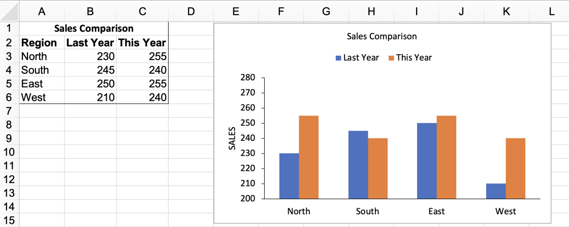
You have been asked to create a column chart and need to make it look the same as the chart provided in the image below.
Your task is to download the ‘SalesComparison-RawData.xlsx’ file and use your spreadsheet knowledge to create the chart shown here. You should attempt to recreate this chart using any columns colors you want, but be sure to:
- Create a clustered column chart.
- Set up the horizontal axis categories and remove horizontal gridlines to match the image.
- Adjust the vertical axis scale and remove vertical gridlines to match the image.
- Add a chart title, vertical axis title, and legend that match those displayed in the image above.
- Ensure your data series are in the correct order.
When you have completed the chart, save it in .xlsx format, then upload that file for evaluation.
After reading the question
Get the template file:
Download Template FileUse "SalesComparison-RawData.xlsx" as the baseline for your answer.
Submit your answer:
Make the requested changes before uploading.
You can upload answers multiple times prior to submission.
Tags
- AI-resistant
- MS Excel
- Axis Titles
- Charting
- Column Chart
Information
Score Distribution
Would you like to see our other questions?
We have 1000+ premium hand-crafted questions for 160+ job skills and 20+ coding languages. We prefer questions with small samples of actual work over academic problems or brain teasers.
Would you like to see our tests?
The following tests contain MS Excel related questions:
On the blog
Since we're all biased and we use incorrect proxies, why not just outsource hiring to experts or recruitment agencies? After all, they've been screening people for many years, so they must know how to do it right?
Not really. I was surprised to discover that many experts...


